Background
The current state of the internet is riddled with accessibility issues, which can have significant repercussions for web users who are blind. In fact, 97.4% of the top 1 million home pages had automatically detectable accessibility issues as of February, 2021.
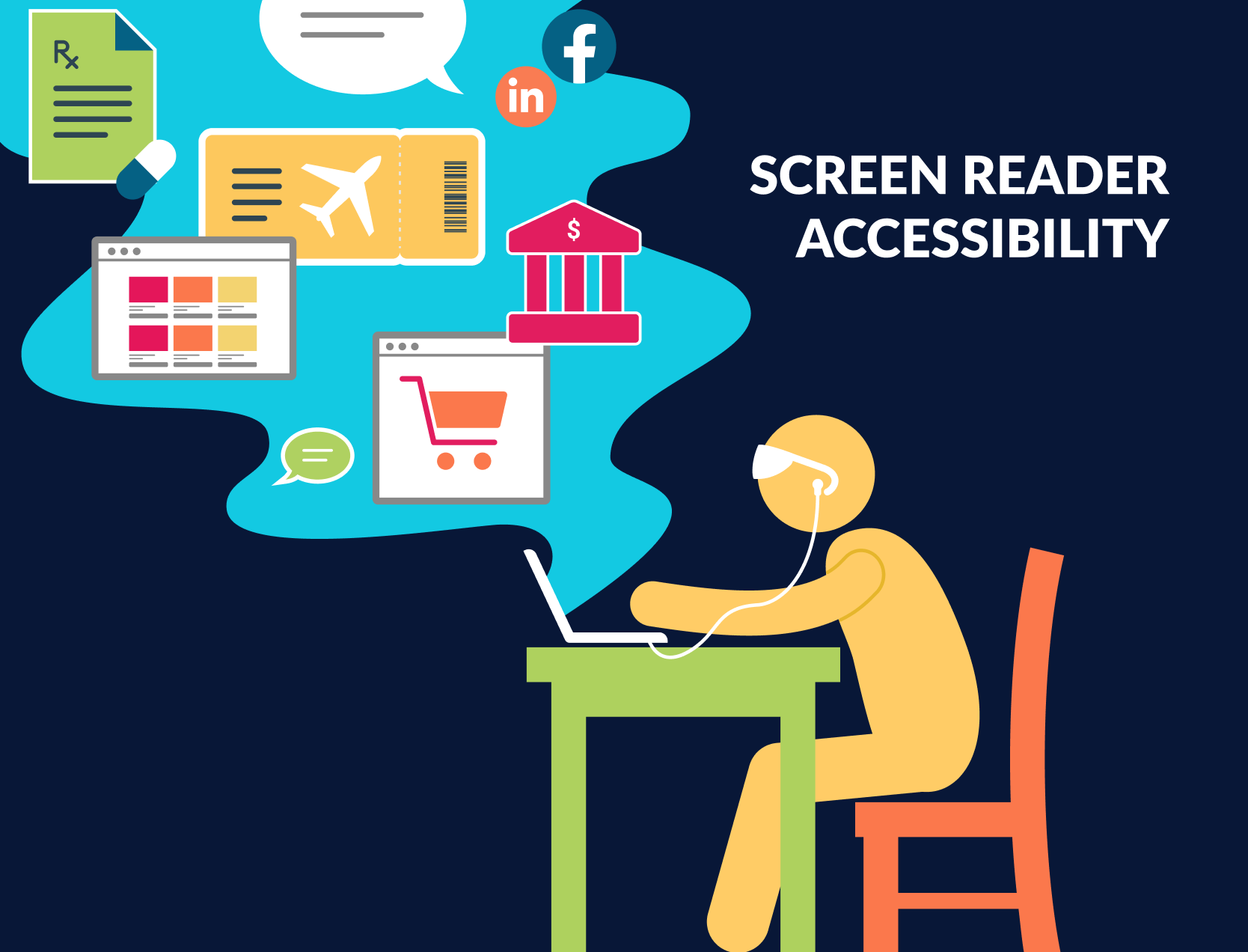
Accessibility problems can range from small, time-consuming barriers to blockers that make it impossible for people who are blind to complete the task at hand. When a website bars a blind user from completing a task, there can be real world consequences. For example, people who are blind may have to give out sensitive information to get help banking online, or they may be forced to rely on someone else to get their groceries.
Our team conducted a 9-month usability study with blind web users to understand which accessibility problems are most urgent to solve. Based on our findings, this whitepaper outlines specific, actionable issues that users consider high priority. It also lays out several system-level changes that push accessibility beyond individual clicks or components.
To fix these problems, we need action at multiple levels. Developers must become familiar with accessibility standards, especially those that can cause severe consequences for blind users. Educational institutions must teach students about accessible practices and why they are important. And those in the assistive technology field must continue building inclusive tools, with a special emphasis on accessibility problems that ripple beyond the screen.
Metrics
Over the past 9 months, our team has conducted 14 interviews, and surveyed 38 people who are fully blind. Our goal was to identify which accessibility challenges faced by these screen reader users have the most significant impact on their lives. In order to evaluate the impact of a specific accessibility challenge, we worked with users to generate the following metrics, ranked in order of importance.
-
Severity of consequences describes how significantly a web accessibility problem can affect someone's life beyond the Internet. For example, ordering the wrong pair of pants likely has less severe consequences than ordering the wrong dosage of medicine.
-
Degree of Inhibition describes how difficult it is for someone to proceed past an accessibility bug. For example, encountering a CAPTCHA might mean it's impossible to proceed, whereas encountering an ad might disorient a user, requiring more time and effort to find a work around. The degree of inhibition can vary based on how confident the user is with a screen reader.
-
Frequency of occurrence describes how often a problem crops up. For example, unlabeled buttons and links appear all over the internet on every type of site, often multiple times within a site. On the other hand, CAPTHCHAs only come up sometimes, in very specific contexts.
For more on these metrics and how they were determined, read our other whitepaper, The Human Impact of Web Accessibility Challenges.
Actionable Interaction Issues
This section outlines 7 common accessibility issues that have the most serious or wide-reaching effects on web users who are blind, according to our respondents and interviewees. Three issues have been further developed into extensive problem descriptions and possible solutions, which are linked in-text, and can be found in the Functional Specifications section of our Content Landing Page page.
Buttons and links not intuitively labeled
Buttons and links present accessibility issues when the actionable text does not indicate what will happen when the user clicks it. For example, at the end of a form, there might be two ambiguous buttons - the submit button and the cancel button. In this case, the screen reader will read out “button, button,” and the user may accidentally click the wrong one. Users want concise and accurate descriptions that clearly indicate what will happen when a button or link is clicked.
Buttons and links do not indicate they are clickable
Occasionally, screen readers read out buttons and links as if they were plain text, because they are coded in an inaccessible way. This can make it impossible for a user to find the correct spot to click, especially if they are new to the web. Accordingly, all buttons and links should indicate to a screen reader that they are clickable.
Disorienting Pop-up Focus
When a user is navigating a website with a screen reader, a pop-up may appear that contains meaningful information, like a login. The screen reader may be unable to detect that pop-up, which means the user is missing out on information they need. Another issue is that pop-ups can appear unexpectedly and instantly change the focus of the screen reader without notifying the user. This unexpected shift can be very disorienting.
Hidden Form Error Messages
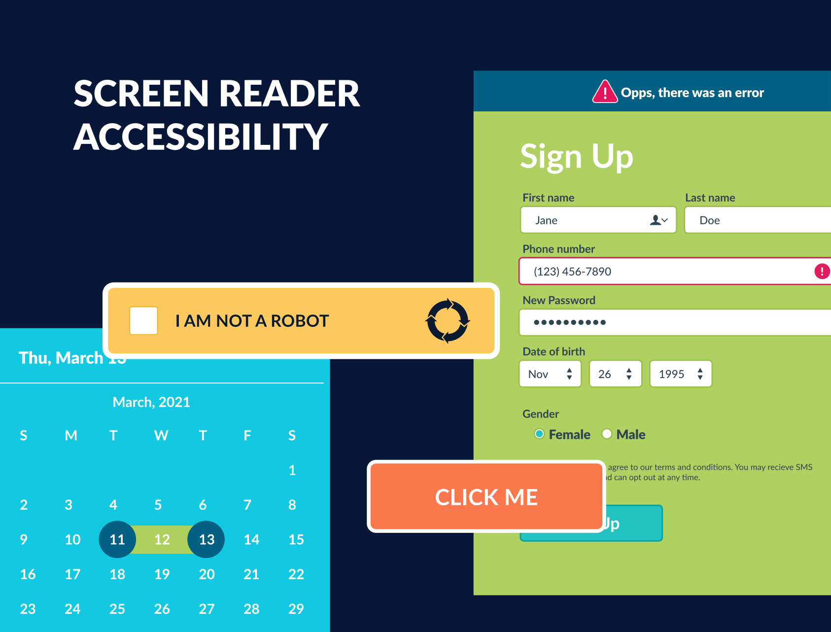
Web form error messages often present disproportionate difficulty for screen reader users. Blind screen reader users do not have access to the visual cues that sighted users can pick up on, such as banners or colors. The focus of a blind web navigator is not drawn to error messages when they appear, so it can be challenging or impossible for users to determine which field(s) have invalid entries.
Absence of Task-Specific Headings
Sighted users can scan a list of search results, but screen reader users often lack this option because there is not always a heading tag on every search result. As a result, screen readers must read every detail on each search result. Users express that it is frustrating and overwhelming to hear details of items they are not interested in. So, each search result should have its own heading to save users substantial amounts of time and mental strain.
Inconsistent Date Pickers
Screen readers are often unable to access and enter dates for date pickers that are visually oriented (like drop-down calendars). Date pickers appear on many forms, and an inaccessible date picker can completely block a user from completing a task, like finding a flight or signing up for a new account. Users in the USA said they’d prefer date pickers that always have a standardized text input option in the form of mm/dd/yyyy.
Required Visual Authentication (CAPTCHAS)
Visual authentication mechanisms can be impossible for people who are blind to complete. This is especially problematic because they often form a barrier at the end of time-consuming, crucial processes. Users reported feeling dehumanized by the fact that CAPTCHAs don’t recognize them as humans, and they would prefer a more intuitive and universal option over the demoralizing, inaccessible “I am not a robot” checkbox.
System Level Challenges
The following system-level challenges would likely require multiple projects, and significant shifts in web development or screen reader paradigms in order to be fully addressed.
Mathematical Language, Graphs, and Diagrams
Currently, screen readers cannot interpret graphical information, such as mathematical language, graphs, and diagrams, which can make these elements completely inaccessible to blind web users. Users said they’d like a way for screen readers to parse this information and deliver audio/tactile feedback in an intuitive manner that provides them with the information contained in this visual content.
State Change Feedback
Web interactions can mislead and demoralize blind web navigators when they provide visual feedback about a change in state, such as an item being added to a cart, but give no audio, haptic, or other indication that there has been a change. Users identified a need for visual information to be conveyed to them through alternative sensory inputs.
Site Updates Change Page Format
When websites update their layout, screen reader users are disoriented and must spend a nontrivial amount of time re-learning how to navigate the page. Changes in placement of components can be demoralizing and lead some users to give up altogether. Users said they'd like to be alerted when a page has significantly changed and would benefit from having a brief summary of the most relevant changes.
Accessible banking sites are also top priority for the blind community because being able to manage finances is critical for a secure, stable, and independent life. Based on her work as an accessibility advocate, Elena points out that "lots of people are willing to get assistance for things like shopping, but don't want to give out their financial information." This brings to light the fact that blind individuals face very real security risks when banking sites are inaccessible, because confidentiality is no longer an option for them.
Recommendation
The actionable interaction issues and system-level challenges listed above make the web a far less accessible place for blind screen reader users. Our team’s human-centered research reveals that fixing these issues would meaningfully improve users’ lives, well beyond the screen.
In the assistive technology realm, our team encourages AT developers to use this list as a jumping off point when deciding what solutions to build out next. To understand why these particular issues will be so impactful, we recommend reading our human-centered insights whitepaper, The Human Impact of Web Accessibility Challenges.”
To upgrade the state of accessibility, we urge web developers to become familiar with these specific, high-impact issues, and to keep them at the forefront of their minds during development. We also encourage developers to understand exactly how inaccessible websites can affect people’s lives, because it is always easier to develop technology for people when we can empathize with them. In the words of one of our interviewees “let blind people beta test.”
 Olin Microsoft SCOPE Team

